
파이썬: matplotlib 기본
matplotlib
matplotlib란?
- 그래프를 편리하게 그릴 수 있도록 기능을 제공하는 라이브러리
- 관행적으로 아래와 같이 호출한다.
import matplotlib.pyplot as plt
matplotlib에서 한글폰트 사용하기
- matplotlib에서 한글폰트를 사용하기 위해서는 다음과 같은 코드를 실행해야 한다.
# 한글 폰트(맑은고딕체)를 사용하기 위한 코드
plt.rcParams['font.family'] = 'Malgun Gothic'
plt.rcParams['axes.unicode_minus'] = False
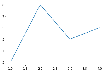
1. 기본적인 그래프 plot
x = [1,2,3,4]
y = [3,8,5,6]
plt.plot(x, y)
plt.show()
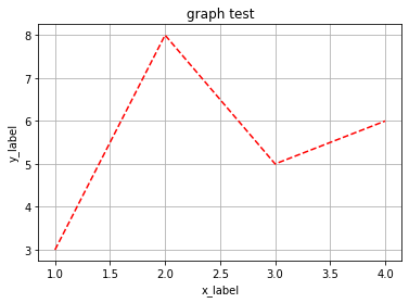
plt.plot(x, y, 'r--') #r:빨강, b:파랑, ... --:파선
plt.grid(True)	#
plt.title('graph test')	# 그래프 제목
plt.xlabel('x_label')	# x축 이름
plt.ylabel('y_label')	# y축 이름
plt.show()
cf. 컬러, 선스타일, 마커 약어
| 컬러 약어 | 컬러 | 선 스타일 약어 | 선 스타일 | 마커 약어 | 마커 |
|---|---|---|---|---|---|
| b | 파랑 | - | 실선 | o | 원 |
| g | 초록 | – | 파선(—-) | ^,v,<,> | ▲(방향별) |
| r | 빨강 | : | 점선(……) | s | 사각형 |
| c | 시안 | -. | 파선점선혼합 | p | 오각형 |
| m | 마젠타 | h,H | 육각형1, 2 | ||
| y | 노랑 | * | 별 | ||
| k | 검정 | + | + | ||
| w | 흰색 | x, X | x(채워진x) | ||
| D, d | ◆, ◇ |
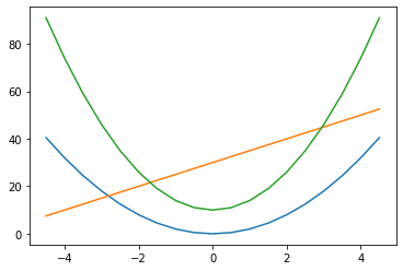
2. figure에 여러가지 그래프 plot
- 한 figure에 그래프 여러개를 plot
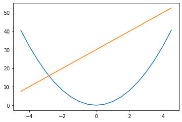
x = np.arange(-4.5, 5, 0.5)
y1 = 2*x**2
y2 = 5*x+30
y3 = 4*x**2+10
plt.plot(x, y1)
plt.plot(x, y2)
plt.plot(x, y3)
#plt.plot(x, y1, x, y2, x, y3) # 한번에 호출하기
plt.show()
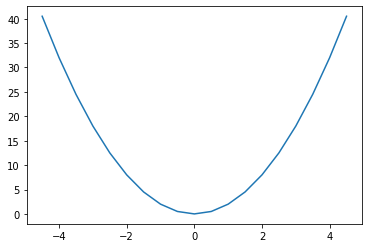
- 여러 figure에 각각 plot
- 새 figure 생성: plt.figure(figure_num)
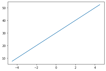
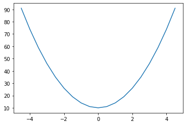
x = np.arange(-4.5, 5, 0.5)
y1 = 2*x**2
y2 = 5*x+30
plt.plot(x, y1)
plt.figure()  #새 평면을 만들어줌
plt.plot(x, y2)
plt.show()
- 특정 figure를 지정하여 그래프 plot: plt.figure(figure_num)
x = np.arange(-4.5, 5, 0.5)
y1 = 2*x**2
y2 = 5*x+30
y3 = 4*x**2+10
plt.figure(1)# 1번 박스
plt.plot(x, y1)
plt.figure(2)# 2번 박스
plt.plot(x, y3)
plt.figure(1)# 1번 박스
plt.plot(x, y2)
plt.show()
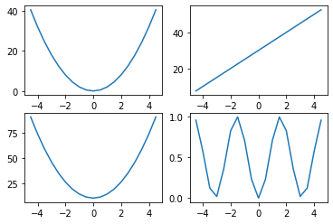
- figure 공간을 쪼개서 plot: plt.subplot(위치)
x = np.arange(-4.5, 5, 0.5)
y1 = 2*x**2
y2 = 5*x+30
y3 = 4*x**2+10
y4 = np.sin(x)**2
plt.subplot(2,2,1) #subplot(행,열,순번)
plt.plot(x, y1)

plt.subplot(2,2,2)
plt.plot(x, y2)

plt.subplot(2,2,3)
plt.plot(x, y3)

plt.subplot(2,2,4)
plt.plot(x, y4)

plt.show()
3. 다양한 종류의 그래프 작성
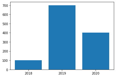
- 막대그래프
#막대 그래프
idx = np.arange(3) # 리스트 인덱스((x,y)쌍이 들어가는 ndarray)
x = ['2018', '2019', '2020']
y = [100, 700, 400]

plt.bar(idx, y) # bar: 막대그래프, y값에 해당하는 막대 그래프 표현
plt.xticks(idx, x) # x축에 사용할 값 지정
plt.show()
- 산점도 그래프
#산점도 그래프
city=['seoul', 'inchun', 'daejun', 'daegu', 'woolsan', 'busan', 'gwangju']

lat=[37.56, 37.45, 36.35, 35.87, 35.53, 35.18, 35.16]	# 위도
lon=[126.97, 126.70, 127.38, 128.60, 129.31, 129.07, 126.85]	# 경도

pop_den=[16154, 2751, 2839, 2790, 1099, 4454, 2995]
size = np.array(pop_den)*0.2 # 산점도를 표현할 원의 크기를 조절
colors = ['r', 'g', 'b', 'c', 'm', 'k', 'y']	# 사용할 원의 색깔

plt.scatter(lon, lat, s=size, c=colors, alpha=0.5)	# scatter: 산점도 그래프
plt.xlabel('lon')
plt.ylabel('lat')
plt.title('pop den') # 제목: 인구밀도
for x, y, name in zip(lon, lat, city): # 각 원 위치마다 도시 이름이 출력되도록 하는 반복문
    plt.text(x, y, name)

plt.show()
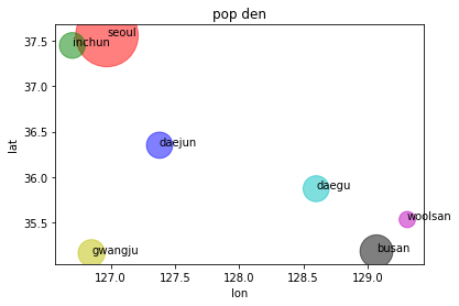
cf. zip: 여러개의 리스트를 묶어서 슬라이싱해주는 파이썬 내장함수
)
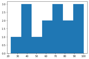
- 히스토그램
# 히스토그램
x = [43, 67, 87, 76, 54, 34, 56, 76, 89, 98, 100, 87, 65, 43, 23] # 점수


# plt.hist(y, bins: 히스토그램 분포를 표현할 구간을 나누는 횟수)
# bins에 정수n이 들어가면 n+1개의 구간이 생긴다.
plt.hist(x, bins=7)
plt.show()
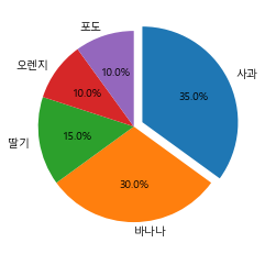
- 원 그래프(파이 그래프)
# 원 그래프(파이 그래프)
fruit = ['사과', '바나나', '딸기', '오렌지', '포도']
result = [7,6,3,2,2]

# plt.pie(result, labels=fruit, autopct='%.1f%%')
# autopct='%.1f%%': 소수점1자리로 비율표시
# 방향 변경 가능: counterclock=False(시계), True(반시계, default)
# 첫번째 항목의 위치변경: startangle = 각도
# explode: 항목별로 중심에서 떨어뜨릴 거리 설정
ex = [0.1,0,0,0,0]
plt.pie(result,
        labels=fruit,
        autopct='%.1f%%',
        counterclock=False,
        startangle=90,
        explode=ex
       )
plt.show()
4. 시리즈/데이터로부터 곧바로 plotting
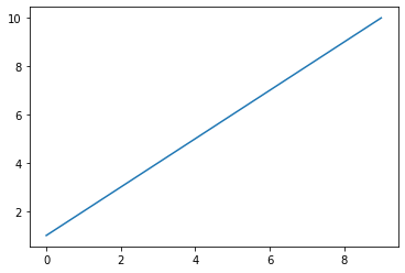
# 시리즈를 바로 plotting
s1 = pd.Series([1,2,3,4,5,6,7,8,9,10])
s1.plot() # x축: 인덱스 / y축: 값
plt.show()
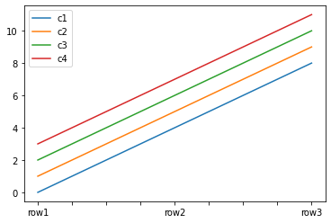
# 데이터프레임을 바로 plotting
arr = np.arange(12).reshape(3,4)
idx = ['row1', 'row2', 'row3']
cols = ['c1', 'c2', 'c3', 'c4']
d1 = pd.DataFrame(arr, index=idx, columns=cols)
d1.plot()
plt.show()
예제
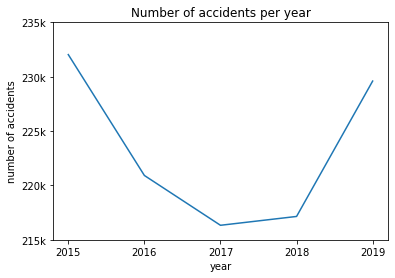
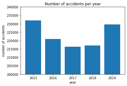
다음의 데이터로 ‘연도별 사고건수’를 꺾은선 그래프와 막대 그래프로 작성하라
data = pd.read_csv('c.csv', encoding='euc-kr')
data
| 발생년 | 사고건수 | 사망자수 | 중상자수 | 경상자수 | 부상신고자수 | |
|---|---|---|---|---|---|---|
| 0 | 2015 | 232035 | 4621 | 92522 | 233646 | 24232 |
| 1 | 2016 | 220917 | 4292 | 82463 | 226283 | 22974 |
| 2 | 2017 | 216335 | 4185 | 78212 | 223200 | 21417 |
| 3 | 2018 | 217148 | 3781 | 74258 | 227511 | 21268 |
| 4 | 2019 | 229600 | 3349 | 72306 | 245524 | 23882 |
꺾은선 그래프
# 연도별 사고건 수 선형 그래프
x = data['발생년'] # .values 붙여도됨
y = data['사고건수']

plt.plot(x, y)
plt.title('Number of accidents per year')
plt.xlabel('year')
plt.xticks(np.arange(2015, 2020))
plt.ylabel('number of accidents')
plt.yticks(np.arange(215000, 240000, 5000), ('215k', '220k', '225k', '230k', '235k'))
plt.show()
막대그래프
# 연도별 사고건 수 막대 그래프
idx = data.index
x = data['발생년']
y = data['사고건수']

plt.bar(idx, y)
plt.title('Number of accidents per year')
plt.xlabel('year')
plt.xticks(idx, x)
plt.ylabel('number of accidents')
plt.ylim(200000, 240000) # 축 범위 지정(ylim(시작값, 끝값))
plt.show()
나가며
물론 여기에 있는 기능들 외에도 무수히 많은 기능이 존재한다.
이 때는 필요할 때마다 아래의 사이트에서 찾아서 활용하면 된다.
matplotlib 위키독스 페이지: https://wikidocs.net/book/5011
Leave a comment